Prime Realty.

Prime Realty.
Prime Realty had been in operation for a while but didn’t have a brand identity that explicitly defined what it stood for. They needed to reflect and accentuate a sense of “luxury”. They were also conversion focused as every single online touchpoint played a critical part in their marketing funnel.
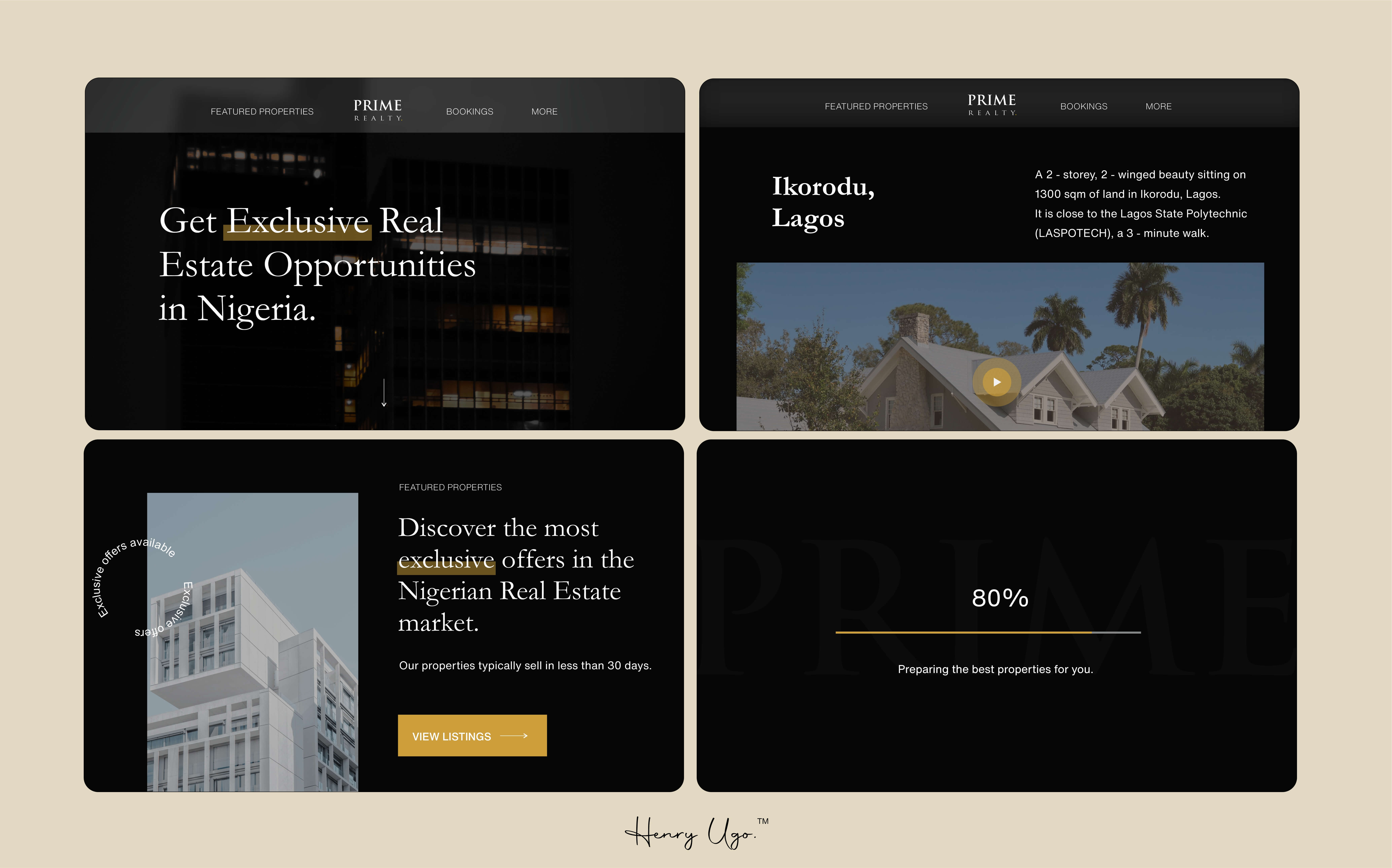
They chose the colors Black and Gold to reflect Prime Realty's
Luxury and Sophistication, but their website didn't do that so
well.
I used Garamond typeface for headings, Averta for body text, gold
color for "Calls to Action", and to highlight keywords to create
an elegant look that matches their quality.
Now this worked very well.

Website
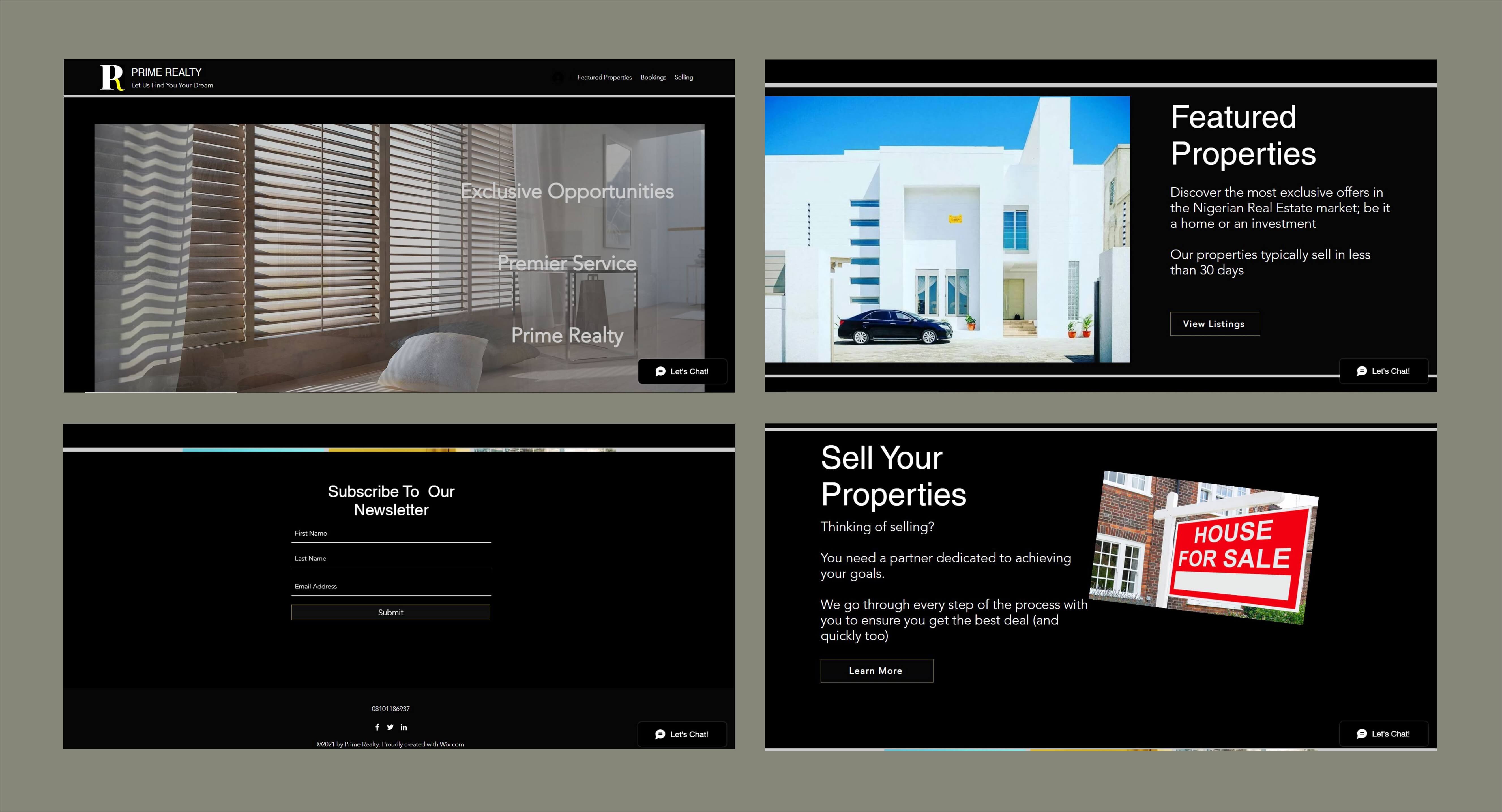
Until we started working together, Prime Realty had been opting for low-cost, temporary fixes and using templates that never quite felt like their brand.

The Website
The imagery, functional animations, transitions, copywriting, all come together to provide a wonderful user experience.

What happened?
After successfully crafting a brand identity that reflected where they were in their journey to deliver value to their clients, I designed and built a funnel-ready marketing-optimized website that saw their metrics grow net positively.
Impact by the numbers
Increase in page views
INCREASE IN LEADS GENERATED
INCREASE IN AVG. TIME SPENT ON SITE
Next Case Study

Co-Founder - Prime Realty
"Henry Did an amazing job of understanding the brand and what we’re trying to achieve. He translated the ideas in our minds to concepts that were authentically who we are and what our customers have come to appreciate. He went above and beyond for us giving generously of his wealth of experience and talent. He was patient and thorough, and an absolute joy to work with. Henry does great quality work… Absolutely world-class."
Ask Prime Realty about working with me: Click here to send them an email